One of the reasons I enjoy motorcycling is my view, the lack of a frame, or at least a frame that moves with my head, that of my full face helmet. Behind the wheel of my rig I’m dealing with a number of frames; the windscreen, the backlight, the side windows, all framed out by pillars. Everything I see has a frame around it. I get out of the vehicle and take in the vistas and, naturally, want to create an image of what I see. The camera goes to my eye and there’s that frame again.
Our compositional eye is naturally drawn to a point that follows the suggestion of the golden mean, a point of interest that the eye travels to through the frame. Superimpose a tic-tac-toe grid on most aspect ratios and you might be surprised how many compositions follow this basic influence on photographic composition, visual design.
You don’t need a camera to see this influence. Create right angles with your thumbs and index fingers, invert one hand over the other and you have a frame. Move the frame around and compose through it. Start identifying this influence in film and you’ll see, over and over again, the main points of interests fall on the intersection of the lines of the tic-tac-toe grid.
Some iPhone camera apps provide the grid. As you compose, see where the strongest and most contrasting points fall on the intersecting lines of that grid, creating movement through the frame.
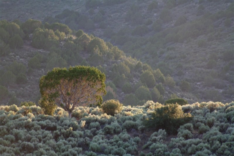
I was asked to shoot on location at Mountain Meadow, just south of Enterprise. It’s history invades my compositions. This frame shows the influence of the lower line in the rule of thirds with the highlight of the sunlight gracing the knoll. Without the composition emphasizing the highlight, there wouldn’t be much here to look at.
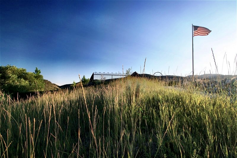
As rules go, some get stretched or broken, as in the shot of the Mountain Meadow monument above. I could’ve panned up a bit creating more negative space with the sky and putting the flag right at the upper right intersection of the grid, but I didn’t want to lose the texture of the grass in the foreground.

This is what I mean by negative space. By pushing the rule of thirds grid down in the frame, lowering my horizon line, the negative space becomes exaggerated. This allows for placement of other graphic items such as a logo, or used as a background for a website landing page.

This vertical composition illustrates the rule of thirds with the strong vertical line of the tree composed on the right vertical axis of the grid.
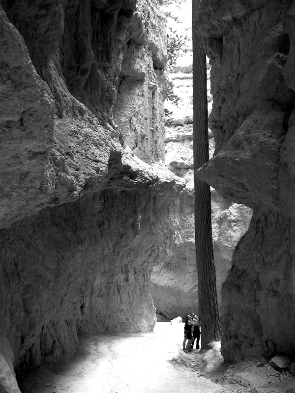
By the way, using people in the shot gives it scale. Without these tree-huggers, we’d have little reference for the depth of this slot canyon at Bryce.
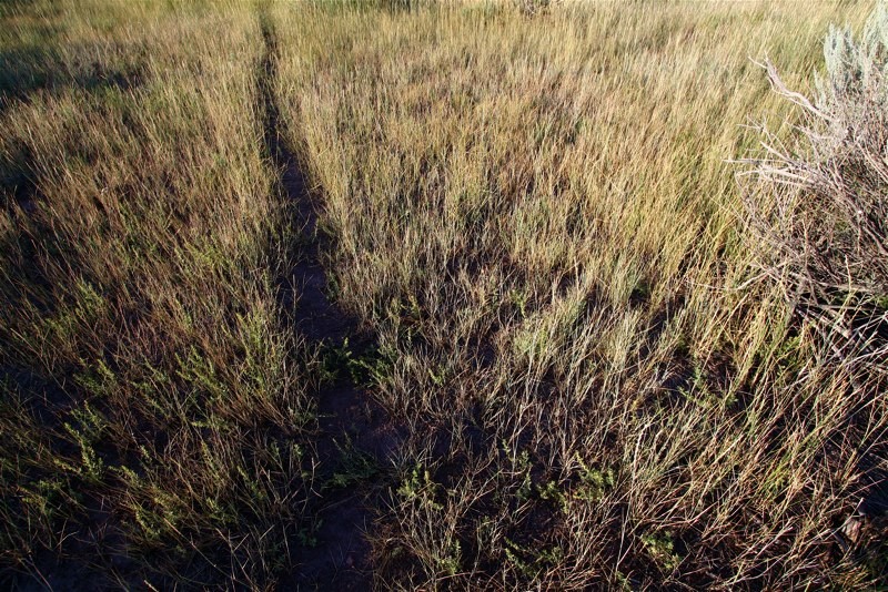
This image of a pathway at Mountain Meadow takes the composing influence of the rule of thirds and introduces a gentle diagonal flow of the path, giving the eye a z-axis inviting it through the frame.
As a rule of thumb, if the area of interest is land or water, the horizon line will more or less be two-thirds up from the bottom. Alternately, if the sky is the area of emphasis, the horizon line may be one-third up from the bottom, leaving the sky to take up the top two-thirds of the picture.
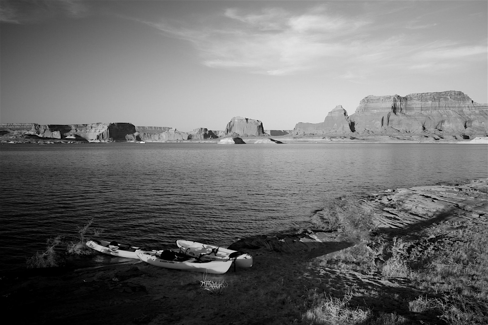
And sometimes there’s a compromise. This image of Padre Bay favors both the negative space of the lake and the sky with the subtle horizon line riding just above center, allowing the detail of the bluffs to fall on the horizontal line of the of thirds.
Practice and time will hone a habit of photographic composition, and using the rule of thirds will help you compose a better frame.
Find more by Eric @ http://corneringconsciousness.blogspot.com
